Drumchapel-Bear
Well-Known Member
Ir looks dreadful. Although I thought the same about the Home Kit when I seen the pictures of that and it's actually a lot nicer in real life, the pics didn't really do it justice.
When did Raith or Falkirk wear black?Got a weird 1990's Raith / Falkirk cut about its jib.
No likey.
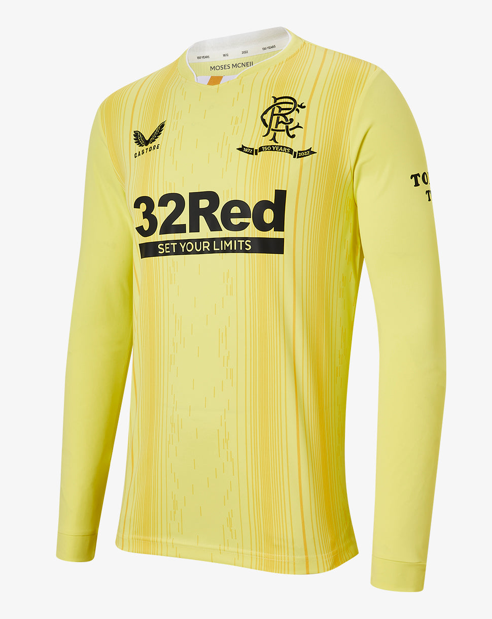
ORANGE PLEASEEEE!
Thanks mate. I remember this going up but never watched it.There was a video interview with Wilson and Bisgrove.
A question was asked about the anniversary kits and the kits for 2022/23, they said jokingly that they both had differing views on what a Rangers kit should be like. With Wilson saying he’s more of a traditionalist when it comes to kits.
Kit discussion starts 27mins 27secs in.
Doesn't mean the picture is black, which it patently isn't. Never heard of photoshop or just poor cameras?
Not exactly the same shade of blue, is it?Could be the photo but it looks blue. So how can we have a blue home and blue away kit!?
)")
What was it people say about if you had 2 Rangers supporters on a desert island within a week there would be 3 Rangers supporters clubs?It’s not gold mate it’s beige. Almost the same beige as the champions tracks stuff from last season.
It is beige mate, dull Matt beige. I love my tops and collect them but castore seem to %^*& stuff up for no obvious reason. It’s bizarre.What was it people say about if you had 2 Rangers supporters on a desert island within a week there would be 3 Rangers supporters clubs?
Seems like here we've got a black and gold 2nd kit AND a navy and beige 2nd kit.
Are you serious? That’s in breach of contract….Fucking hideous.
Jesus Christ that’s so amateur. That isn’t the shop’s URL and that one doesn’t work ffs.
The home kit doesn’t have anything on the shouldersI can’t stand this obsession they have with putting shite on the shoulders. It’s on everything this season. Lazy and uninspiring design. Something a tim would design for us.
Yes it doesJesus Christ that’s so amateur. That isn’t the shop’s URL and that one doesn’t work ffs.
It doesn't, it gives you a 404.Yes it does
Not me, takes me to the Rangers home pageIt doesn't, it gives you a 404.
If you look at the url once it’s taken you there the shop is gone, do it a second time and you’ll seeNot me, takes me to the Rangers home page
That's the exception, it’s on most everything else.The home kit doesn’t have anything on the shoulders
I know but it’s not a broken link, still takes you to the Rangers siteIf you look at the url once it’s taken you there the shop is gone, do it a second time and you’ll see
Yeah with a 404 error, It’s amateurish mateI know but it’s not a broken link, still takes you to the Rangers site
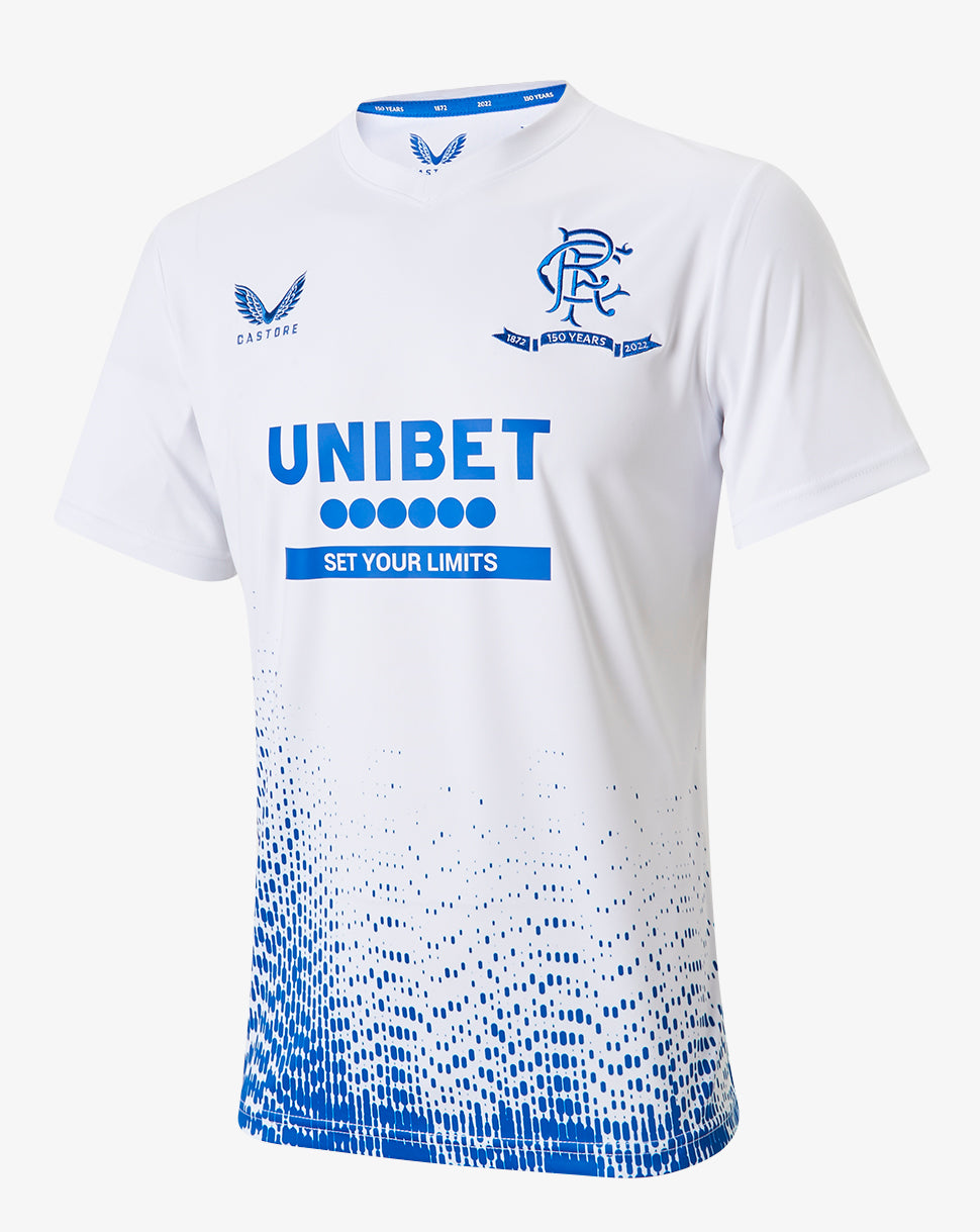
Our worst ever home kit.View attachment 2827
The collar on this kit and this seasons GK kits is giving me heavy Puma 2013 vibes at the height of Ashley being in control.
Really wouldn’t be hard to have it redirect to the correct address either. Basic stuff.Yeah with a 404 error, It’s amateurish mate
this.Love the home kit, but not a fan of that.
Presume it will look better in proper lighting.
So apart from the neck and it almost being the exact same, it's a template? Haha ok. FFSThe neck aside, that's almost the exact name template as the white away jersey from last season.
Whats the gold all about even on the home top?ugly top aside, I don't understand why we would be using any colour other than red or white or a combination of both on our 150th anniversary.
I’ve not got a dog in this fight but those jumpers do have designs on the shoulders.
*steps back*
Well spotted. Point stands even without those. I’m all for criticising Castore but this is a strange one.I think a large percentage is just people having a laugh.Don't know if its just an age thing but I really don't get why people 'seemingly' get so upset over a football strip.
I say seemingly as I don't know if its this new internet thing where being the angriest, or appearing so, makes them feel like they look cooler than everyone else, in reality though they probably aren't fussed but need to be seen to be so angry about everything on follow follow.
Its really pathetic to see.
Come on mate, this is ruining the legacy of 55 and will ruin 56. This is the worst thing to happen to our club in the last decade, easily.Don't know if its just an age thing but I really don't get why people 'seemingly' get so upset over a football strip.
I say seemingly as I don't know if its this new internet thing where being the angriest, or appearing so, makes them feel like they look cooler than everyone else, in reality though they probably aren't fussed but need to be seen to be so angry about everything on follow follow.
Its really pathetic to see.
I am only guessing on this but I think what they went for (and failed with so far IMO) was the 1950's home shirt. 2010/11 black shirt, 1994/95 purple shirt and a gallant pioneers shirt (if rumours are to be believed)So this season we have four kits for our four founders.
Anyone would surely have had a home, away and third with the anniversary badge and have all 3 of them based on classic favourites and then the fourth kit would be The Gallant Pioneers star kit...
It boggles my mind how they've already fucked that up. Were they too afraid that'd be playing it safe?
I wonder if its just the ego of designers. People being paid to design these probably want to put their own stamp on it rather than being told "copy this".So this season we have four kits for our four founders.
Anyone would surely have had a home, away and third with the anniversary badge and have all 3 of them based on classic favourites and then the fourth kit would be The Gallant Pioneers star kit...
It boggles my mind how they've already fucked that up. Were they too afraid that'd be playing it safe?
Panels on the shouldersSo apart from the neck and it almost being the exact same, it's a template? Haha ok. FFS
Yeah I could see that and agree that they're making an arse of it.I am only guessing on this but I think what they went for (and failed with so far IMO) was the 1950's home shirt. 2010/11 black shirt, 1994/95 purple shirt and a gallant pioneers shirt (if rumours are to be believed)