Blastie Bear
Well-Known Member
I'll reserve judgement until I see a photo that wasn't taken on Lana Wolf's couch.
I can’t believe people pretend their designs are actually any good.Garbage. Like the majority of Castore stuff.
I can’t stand this obsession they have with putting shite on the shoulders. It’s on everything this season. Lazy and uninspiring design. Something a tim would design for us.An opportunity has been missed with the obsession of sneaking in Wee pointless colour panels , they do it with the shorts as well . It’s utterly bizarre fixation on making strips “ busier “ instead of allowing them to speak for themselves . I don’t think it’s horrific but I agree it could and should have been so much better .
The gold is getting old really really fast for me
It’s still Castore next season mate .Same.
Hoping the 150 range and the 4th kit are decent.
Apart from that, I’m already looking forward to next season and no gold.
It’s still Castore next season mate .

Ffs it’s red gold black and white! Are we celebrating Chinese New Year? It’s genuinely the worse kit I’ve seen us have. 2 of our worst kits have been castore ffs. I gave them a chance I just want rid of them now!! Ffs more beige on stuff just eff off with it.I've adjusted the colours in the image to remove the weird blue hue. It looks ok to me if black and red.

Ross countyThat’s a *insert team who wear navy/black* kit
It’s black .That's a horrendous effort:
1. Nothing at all to do with club, colours, history etc
2. Looks a cheap Scotland top from when Diadora made them and Duncan Shearer led the line
3. It's blue and so can't be worn against anyone
Castore really are taking the absolute piss now.
It's black.That's a horrendous effort:
1. Nothing at all to do with club, colours, history etc
2. Looks a cheap Scotland top from when Diadora made them and Duncan Shearer led the line
3. It's blue and so can't be worn against anyone
Castore really are taking the absolute piss now.
I like the home one, apart from the beige. Your right though they are horrendous. 6 kits so far 1 gets a pass and 2 others are ok. Unreal.150th anniversary and castore have produced two of the worst kits I can remember.
That's a horrendous effort:
1. Nothing at all to do with club, colours, history etc
2. Looks a cheap Scotland top from when Diadora made them and Duncan Shearer led the line
3. It's blue and so can't be worn against anyone
Castore really are taking the absolute piss now.
Not in any of the photos.It’s black .
1. I know but not one picture so far has shown it as blackI think it’s
I don’t like it, but…
1. Our socks are black and red top, colours of Govan.
2. Duncan Shearer last played for Scotland in 1995, when Scotland’s kits were made by Umbro.
3. It’s black. And we don’t only wear away/third kits when there’s a colour clash. Regularly wear changed kits away to Aberdeen (red) and Hibs (green)
4. I think I’ve typed this out and I think you were only at the wind up.
Everyone, AnyoneFfs it’s red gold black and white! Are we celebrating Chinese New Year? It’s genuinely the worse kit I’ve seen us have. 2 of our worst kits have been castore ffs. I gave them a chance I just want rid of them now!! Ffs more beige on stuff just eff off with it.
1. I know but not one picture so far has shown it as black
2. I was joking based on the photos looking like a really bad sub Scotland or even Ross County effort
3. If it is black then fair enough but still hideous.

That looks more blue to me now.I've adjusted the colours in the image to remove the weird blue hue. It looks ok to me if black and red.

The top is black.Not in any of the photos.
Still hideous though....way too busy, with colour clashes everywhere. Like a Chinese restaurant sign.
Not. In.The.Photos.The top is black.
Yes. In. The. Photos.Not. In.The.Photos.
how would I know it's black based on only having seen the photos?
Okay, fair play to your tremendous eyesight. Everyone I know is seeing it as blue.Yes. In. The. Photos.
Come on, it is horrendous....whether it is our top or someone else's.Hold on, dont tell me FF unhappy about a kit design?
I can’t believe people pretend their designs are actually any good.
Kits are garbage and tacky, just like the training gear.
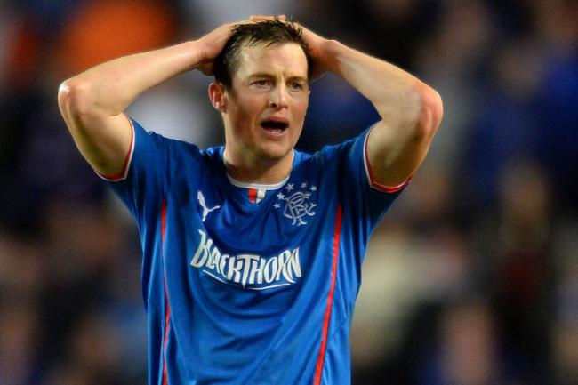
That wee white and gold bit on the front of the collar is giving me serious Puma/Blackthorn/Jon Daly vibes.I've adjusted the colours in the image to remove the weird blue hue. It looks ok to me if black and red.


Not. In.The.Photos.
how would I know it's black based on only having seen the photos?
The number of tops sold would say differentKits have been massively disappointing so far in my opinion
