
Everyone said the same stuff about the home top when it was leaked, then they loved it. I imagine this will be much the same.
You are using an out of date browser. It may not display this or other websites correctly.
You should upgrade or use an alternative browser.
You should upgrade or use an alternative browser.
Our new away kit leaked (allegedly)
- Thread starter El Chapo
- Start date
- Status
- Not open for further replies.
Nah, don’t wait , just pile in with horrible comments about what might be Rangers shirt. If they don’t like it maybe ease up a bit and show some respect?
Respect to an as yet unreleased top?
Are we gonna hurt its feelings?
Corkinator
Well-Known Member
The bottom 2 have shoulder patches on!! Lol. That the exception on almost everything else. Last seasons lots were the same, shoulder things on them. It looks shit!

Drop the Shoulder
Well-Known Member
My exact thoughts. Honking.Looks like a Ross County top.
Corkinator
Well-Known Member
A goalie kit, home kit and a training top don’t have epaulettes on! Almost everything this season looks the same. The black kit looks like a copy of last season’s white kit!!I’ve not got a dog in this fight but those jumpers do have designs on the shoulders.
*steps back*
respect? to whom? a shirt? the designer? the manufacturer who lets face it deserves a hell of a lot of stick after the last year?Nah, don’t wait , just pile in with horrible comments about what might be Rangers shirt. If they don’t like it maybe ease up a bit and show some respect?
Chinggis_could_I_khant
Well-Known Member
I'd be passing on that one.
Corkinator
Well-Known Member
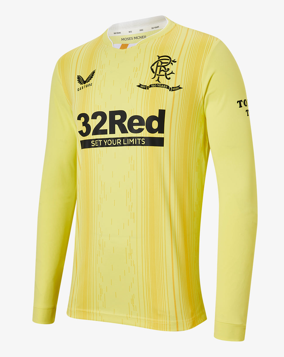
I think, from my point of view, it looks really really tacky and cheap. It also looks like the same template as last seasons away kits. The gold (beige) is horrendous. That and the red training top looks like something you would see dancers wear at a Chinese New Year celebration. IMHO they’re horrible. But it’s subjective, I guess.I'm not really sure what actually makes a good or bad football top?
I can see why totally off the wall designs and colours would be seen as horrible but most of the time our kit manufacturers play it pretty safe.
The Castore jerseys seem like pretty standard football tops. Side panels, shoulder panels, collars, cuffs it's all standard across manufacturers.
Not really sure what makes a jersey horrendous. Unless boring is horrendous or vile or whatever else gets thrown around.
I definitely see people's objection to the "gold" as its a bit of a bold choice from a Rangers perspective. Also the sponsor is always going to be an issue. Other than these the Castore jerseys have just seemed like pretty standard football tops.
What's causing the extreme negative reactions?
WeAr3Th3Pe0ple
Well-Known Member
Last years Retro top was amazing. I wish we had worn it more often. Maybe even as a home top for this year. I get its not really possible due to lack of sponsor,but it remains my fave from the Castore era so far.I wonder if its just the ego of designers. People being paid to design these probably want to put their own stamp on it rather than being told "copy this".
Obviously there would be branding issues with copying any of our Adidas stuff with 3 stripes. I wouldn't be surprised if Nike held some kind of rights to their own designs and those couldn't be copied too closely.
Always thought it was weird that we never once saw a copy of the orange and navy vertical stripes from the Adidas days. Yet the tims have had that yellow and black monstrosity a load of times.
The home jersey is trying to be more like a classic design but with sponsors and stuff that never really works.
The away is just a standard football jersey and I expect the same will be true with the 3rd (maybe going adventurous with the colour).
Was last seasons "retro" kit even that popular?
Yeah, they should have gone 100% with homage to classic favourites across the 3 kits. It's too bad and too late now.
For the 4th jersey I would have wanted something like the Danish all red euro effort. Have the crest, sponsor, collar etc just a very slightly different tone of blue to the main blue of the jersey so it's just a plain blue top with everything else being subtle. I think we didn't even have a crest on the jerseys until the 70s?
F*ck it. They are just football tops so whatever.
DJ_RFC_1872
Well-Known Member
Can we not just wait to see what it looks like when launched.
No one liked look of home kit and when it was launched it looked better than leaked photos.
Hopefully this is same.
If i remember rightly home kit was leaked and then released not long after so maybe be out this Saturday?
No one liked look of home kit and when it was launched it looked better than leaked photos.
Hopefully this is same.
If i remember rightly home kit was leaked and then released not long after so maybe be out this Saturday?
Mynameismud
Well-Known Member
Not like you at all RobertI'll go against the grain, I like it.
Reynold
Well-Known Member
I think, from my point of view, it looks really really tacky and cheap. It also looks like the same template as last seasons away kits. The gold (beige) is horrendous. That and the red training top looks like something you would see dancers wear at a Chinese New Year celebration. IMHO they’re horrible. But it’s subjective, I guess.

ShotaShuffle
Well-Known Member
Hi Castore
try again
Kind Regards
try again
Kind Regards
Barba Roja
Well-Known Member
Doesnt look great tbh…Hopefully just a bad quality picture and the launch will show it in a better light.
How are we so close to the season starting yet have only released the home kit? Do we normally leave it this late?
How are we so close to the season starting yet have only released the home kit? Do we normally leave it this late?
Boab4
Well-Known Member
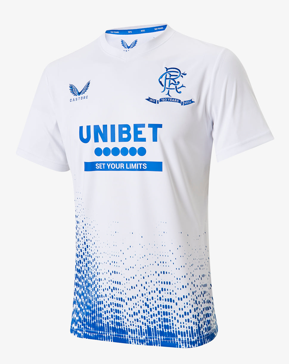
It's awful. I'm trying my best to like the new home top but just can't see past the yellow/gold.The gold is getting old really really fast for me
Boab4
Well-Known Member
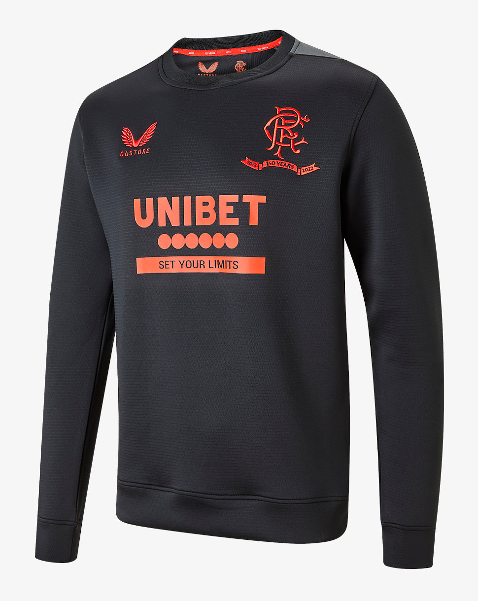
The top in that picture doesn't look black at all, I don't know why people are so adamant. I took a screenshot and put the saturation right up and it comes up as blue as blue can be. I still don't believe it's our 3rd strip.
It's not our 3rd it's the away, we are adamant it's black as the tag attached to it says black away shirt
)")
Very fist thing I said in my group chatReminds of a Liverpool away top from the last few years.
TheEgg
Well-Known Member
The top in that picture doesn't look black at all, I don't know why people are so adamant. I took a screenshot and put the saturation right up and it comes up as blue as blue can be. I still don't believe it's our 3rd strip.
 friendship poems com
Even THAT is better than this
GarMckin
Well-Known Member
There was a video interview with Wilson and Bisgrove.
A question was asked about the anniversary kits and the kits for 2022/23, they said jokingly that they both had differing views on what a Rangers kit should be like. With Wilson saying he’s more of a traditionalist when it comes to kits.
Kit discussion starts 27mins 27secs in.
You've posted a video to show that Wilson doesn't like the kits and the only thing he says about these kits are 'the kits for next season look excellent' and then that both training and match day 'kits for next season are outstanding'. He says he's a traditionalist and always looking to change things but he's full of praise for the kits.
Bouncebackability
Well-Known Member
You've posted a video to show that Wilson doesn't like the kits and the only thing he says about these kits are 'the kits for next season look excellent' and then that both training and match day 'kits for next season are outstanding'. He says he's a traditionalist and always looking to change things but he's full of praise for the kits.
I posted the video that the OP was looking for.
Not sure where you’re getting the idea that it was posted it to show Wilson doesn’t like the kits.
GarMckin
Well-Known Member
I posted the video that the OP was looking for.
Not sure where you’re getting the idea that it was posted it to show Wilson doesn’t like the kits.
Apologies, I thought you were the OP he was asking the question to who said no wonder Wilson didn't like the kit.
Baloo72
Well-Known Member
Underrated Egg
Gordon Alexander
Active Member
I like it, looks quite classy, but would look better without the sponsorships.
Mainstandbear
Well-Known Member
Nobody went batshit yet and called it a holocaust?
LarkfiedLoyalNS
Well-Known Member
That’s howling. 
TW1988
Well-Known Member
All the kits are rank rotten.
Not sure if the link will work but can’t post pics.
Its not hard to design a kit!
Apparently it isAll the kits are rank rotten.
Its not hard to design a kit!
Nobody went batshit yet and called it a holocaust?
I think “absolutely disgusting” and “red top is a Chinese new year outfit” are the current leaders for this years Castore offerings.
Time yet though.
Exciting.
Mainstandbear
Well-Known Member
I remember the home top was actually called a holocaust I had to take a minute and read the post again I couldn't believe a poster got that triggered about a football top design that he used language like that.I think “absolutely disgusting” and “red top is a Chinese new year outfit” are the current leaders for this years Castore offerings.
Time yet though.
Exciting.
Rodney Wallace
Well-Known Member
Anyone know when shirt is released? Would think having fans in vs Brighton and Madrid would be a shout this weekend?
Truffle Shuffle
Well-Known Member
Both our kits then are poor this season.
brain
Well-Known Member
The tag is nowhere near legible?It's not our 3rd it's the away, we are adamant it's black as the tag attached to it says black away shirt
rangers for life
Well-Known Member
It really should have been first kit on this list of our away shirts.
Boab4
Well-Known Member
The tag is nowhere near legible?
See post #134. Clear as day.
High Society
Well-Known Member
That’s great patter, am splittin ma sides laughinRespect to an as yet unreleased top?
Are we gonna hurt its feelings?
brain
Well-Known Member
Haha, yeh clear as day because it’s a different picture. Looks like a fake to me, the top isn’t black. Black tops don’t turn blue when you turn up saturation.See post #134. Clear as day.
It’s blackHaha, yeh clear as day because it’s a different picture. Looks like a fake to me, the top isn’t black. Black tops don’t turn blue when you turn up saturation.
Kingdom Bear
Well-Known Member
The gold on everything is awful … it’s just not Rangers
brain
Well-Known Member
I’m editing both photos and the top turns bright blue from turning up saturation. That can happen with a navy but not with a black, it doesn’t make sense. Time will tell.It’s black
Boab4
Well-Known Member
Haha, yeh clear as day because it’s a different picture. Looks like a fake to me, the top isn’t black. Black tops don’t turn blue when you turn up saturation.
I'm sure we will find out soon enough.
The Barrel
Well-Known Member
Designers can get it right. Inter (albeit it's not a proper Inter strip), that Brazilian one with the map, Man City paisley pattern (not gorgeous but very different), etc. My moan is that for a special year it seems the designers spent 5 minutes on our shirts...
- Status
- Not open for further replies.