
giogaddi
Well-Known Member
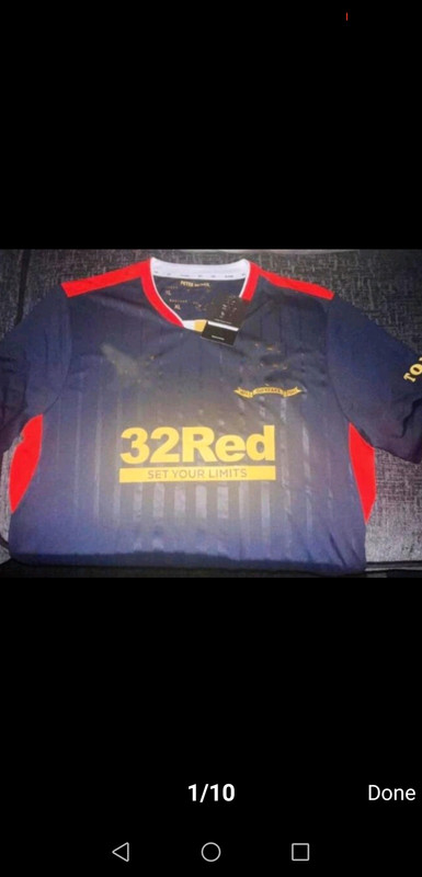
It's is 100% black.Haha, yeh clear as day because it’s a different picture. Looks like a fake to me, the top isn’t black. Black tops don’t turn blue when you turn up saturation.
It's is 100% black.Haha, yeh clear as day because it’s a different picture. Looks like a fake to me, the top isn’t black. Black tops don’t turn blue when you turn up saturation.
Designers can get it right. Inter (albeit it's not a proper Inter strip), that Brazilian one with the map, Man City paisley pattern (not gorgeous but very different), etc. My moan is that for a special year it seems the designers spent 5 minutes on our shirts...
I like them as they pay us and pay us on time but their stuff is generally pish.Would echo this. Been incredibly uninspiring. Right down to not even stitching the founders names on the top.
I think the fallout would be even worse if we never endured the Ashley shit show. We are just grateful to have folk that pay, and as always fans endure to benefit the club.I like them as they pay us and pay us on time but their stuff is generally pish.
Veerman to parachute into the stadium at half time of the Brighton game wearing it?Wonder if we’ll see it at the weekend?
You’re right, some of the mock up kits online have been superb, the white one with the light blue star was one of the best away tops I’ve seen for us.I’m going to get moaned at for moaning but how have Castore managed to make two shite kits (my opinion of course) when there’s wee guys on computers on FF/Twitter that can design kits perfectly. I can’t believe there has been fan input to these kits either
Some of it is red and goldIt's is 100% black.
")

They may have screwed us over but Hummel > Castore
I’m going to get moaned at for moaning but how have Castore managed to make two shite kits (my opinion of course) when there’s wee guys on computers on FF/Twitter that can design kits perfectly. I can’t believe there has been fan input to these kits either
What happened to the badges? Someone has used a digital repair tool on that to mess it up.
I think the" leak" originated on Dhgate who have been selling the shirt for more than a week.
Didnt try. Did. They owe us over £3mHummel never screwed us over, the problem was that we used a middle man in the deal to try and skirt around the legal issues with leaving Ashley. It was elite (or whatever there name was) that tried to run off with the cash.
) lifts that title come the end of the season I wouldn't care if he was wearing his pajamas.I really hope so because it’s shockingly bad and not black despite people insisting it is.
I think the" leak" originated on Dhgate who have been selling the shirt for more than a week.
People reckon I'm colour blind but... Isn't that basically our home kit but with added red bits? It is blue isn't it? A dark blue?

It literally is our keeper kit in a different colourway so hopefully it really is a dhgate fakePeople reckon I'm colour blind but... Isn't that basically our home kit but with added red bits? It is blue isn't it? A dark blue?
I'm not loving the gold on the new kits tbh, or maybe just the way it's designed. Having the gold but white trims is playing with my ocd. As I live in the arse-end of nowhere I only saw the new home kit for the first and only time a couple of weeks ago and I have to say I wasn't a fan of the gold. It didn't look gold for a start. But as long as Captain Tarvel (yes, it's 6:48 and I came up with that...
It looks very dark blue in a shitty photo but it’s been established that it’s black.You don't think it looks blue?

 fb.watch
It looks like a can of Tetleys number 4 lager (which is also awful!)
I think the" leak" originated on Dhgate who have been selling the shirt for more than a week.
I haven't bought a black Gers top yet and ain't starting now.We’ve done the whole black kit thing recently. In fact this will be the 7th one in 11 years.
Just disappointed it wasn’t properly thought about.
Stitching on the inside of the back of the neck would be daft. Think about how that’s gonna rub. There’s a reason most sports stuff is printed onto the back of the neck than labels etc nowWould echo this. Been incredibly uninspiring. Right down to not even stitching the founders names on the top.
It would also be visible on the outsideStitching on the inside of the back of the neck would be daft. Think about how that’s gonna rub. There’s a reason most sports stuff is printed onto the back of the neck than labels etc now
For our 150th kit , this should have been an absolute nailed on belter for the ages . Instead of throwing out 15 training tops , bright Orange trackies , and jigsaws from the challenge cup , Castore should have concentrated 100% on giving us three , not four , absolute class kits to be proud of for 150th year . Ones that every single fan would want .Stitching on the inside of the back of the neck would be daft. Think about how that’s gonna rub. There’s a reason most sports stuff is printed onto the back of the neck than labels etc now
That’s already confirmed,4th shirt in OctoberI get the feeling there will be more than 3 kits this season again. Maybe a cup shirt but definitely a shirt for around the actual anniversary (same time time Edmiston House opens) That will be the gallant pioneers shirt, even though I think I'm right in saying they never wore it.
I get the feeling there will be more than 3 kits this season again. Maybe a cup shirt but definitely a shirt for around the actual anniversary (same time time Edmiston House opens) That will be the gallant pioneers shirt, even though I think I'm right in saying they never wore it.
)")
It’s intentional. DHGate cover the badges so they can’t get told to take the photos/listings down.What happened to the badges? Someone has used a digital repair tool on that to mess it up.
For our 150th kit , this should have been an absolute nailed on belter for the ages . Instead of throwing out 15 training tops , bright Orange trackies , and jigsaws from the challenge cup , Castore should have concentrated 100% on giving us three , not four , absolute class kits to be proud of for 150th year . Ones that every single fan would want .
Regarding the print of the founders name , it should have been done on a wee hologram tag that you get on some kits in the bottom corner . Something that would stay and not rub off . The kits themselves where do I start , let’s just say the garish yellow/gold should have been dismissed instantly by focus groups worth their salt . If it had to be gold it should have been done in the style of Italy / Chelsea kits we’ve seen .
I’m reluctant to be too critical but I feel we have been let down overall by what looks like rushed, Ill thought out kits that could have been designed by Joe Bloggs in 5 minutes in his mums loft .
I’ll get criticised for saying it but here goes - Ive defended them as I think some reactions have been OTT on the kits , however truth be told I can’t wait to see the back of Castore , and I want Nike or Adidas or even umbro next . I await the incoming abuse .
Talking of OTT reactions....For our 150th kit , this should have been an absolute nailed on belter for the ages . Instead of throwing out 15 training tops , bright Orange trackies , and jigsaws from the challenge cup , Castore should have concentrated 100% on giving us three , not four , absolute class kits to be proud of for 150th year . Ones that every single fan would want .
Regarding the print of the founders name , it should have been done on a wee hologram tag that you get on some kits in the bottom corner . Something that would stay and not rub off . The kits themselves where do I start , let’s just say the garish yellow/gold should have been dismissed instantly by focus groups worth their salt . If it had to be gold it should have been done in the style of Italy / Chelsea kits we’ve seen .
I’m reluctant to be too critical but I feel we have been let down overall by what looks like rushed, Ill thought out kits that could have been designed by Joe Bloggs in 5 minutes in his mums loft .
I’ll get criticised for saying it but here goes - Ive defended them as I think some reactions have been OTT on the kits , however truth be told I can’t wait to see the back of Castore , and I want Nike or Adidas or even umbro next . I await the incoming abuse .
It is black. Another picture has the label saying its black. I look forward to you coming back on after the launch to apologise for talking nonsenseI really hope so because it’s shockingly bad and not black despite people insisting it is.
Yeah, the label did say black and it was still obviously navyIt is black. Another picture has the label saying its black. I look forward to you coming back on after the launch to apologise for talking nonsense
Now THIS is more like it!It looks like a can of Tetleys number 4 lager (which is also awful!)
Just waiting on someone saying it's the same colour as the home kitOur supposed away kit (awful)
Spurs: hold my beer
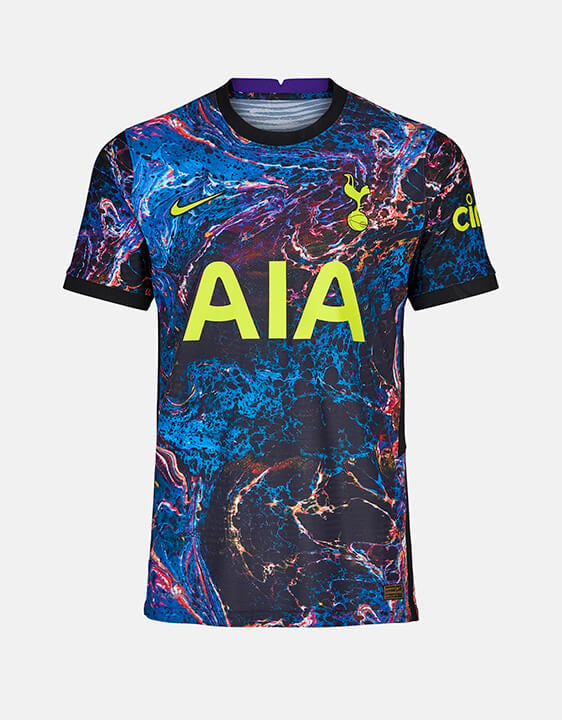
I like itOur supposed away kit (awful)
Spurs: hold my beer