LaidbackLaudrup
Well-Known Member
Follow follow Karen’s out in full force.
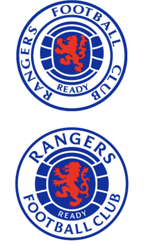
So timeless that this is the fourth iteration of the crest? The lion is more detailed.In 15-20 years once every single brand has changed to a minimalist logo the trendy thing will be to have more intricate logos once more
Ours is timeless, I would've just left it
Don't mind the new one either
Lion should be facing towards UlsterI like it. It's not a huge change and the Ready Crest had always changed over time. They've missed the "Aye" out for some reason though?
I await the "significantly stauncher than yow" mob demanding the lion should be wearing a bowler hat or some other such nonsense.


After looking at the new, and old, it’s barley changed. Not enough to get upset over.
Also people talking about tradition are attention seeking.
The badge was last changed up in 1991, hardly traditional if it’s only 30 years old compared to our last one.
Lion should be facing towards Ulster
)")


Its like they've designed it with a soft family friendly image in mind. Rounder with less harsh lines or edges. Really not a fan
So timeless that this is the fourth iteration of the crest? The lion is more detailed.
Sorry, really not in to that new design. I find the crest very hard to ever possibly improve on. Its perfect as it is. Hope this doesn't go ahead.
")
The only real notable change is were the writing is situated I think that's a marketing thing if I'm honest I like it
Its like they've designed it with a soft family friendly image in mind. Rounder with less harsh lines or edges. Really not a fan
Really cant work out why that would annoy anyone?
It's been tidied up and looks good.
Couldn't get on here quick enough when I got the e-mail as I knew there would be a few meltdowns about it, I was not disappointed
Not many bites so far.I like it. It's not a huge change and the Ready Crest had always changed over time. They've missed the "Aye" out for some reason though?
I await the "significantly stauncher than yow" mob demanding the lion should be wearing a bowler hat or some other such nonsense.
I thought I'd get plenty as wellNot many bites so far.
If you compare the two, the word rangers is on its side. The new one it is the centre piece.Well, I will: fcking awful.