
I like it, only issue with me is the 'Rangers' font being bigger than the 'Football Club' font.
It's killing my OCD.
It's killing my OCD.
What appears to be the new keeper's top is on the new website as well: https://www.Rangers.co.uk/team/mens-team/1zagW2Yj9Dys5huB1Uq6DF
Anyone else still not getting MyGers emails? (checked my junk folder and my contact preferences on the website). I’ve also emailed about this issue last week and not had a response.
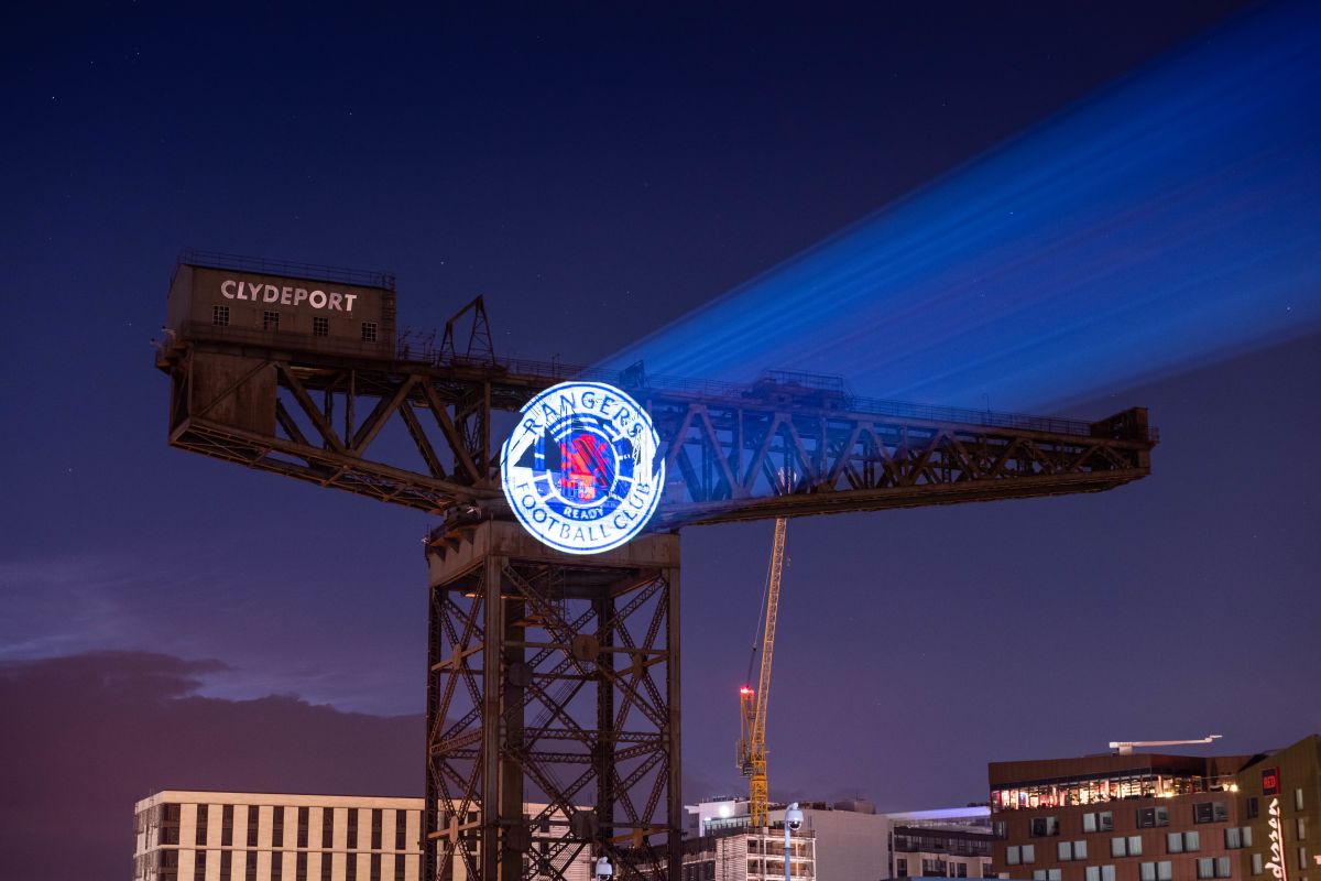
It’s been simplified, cheapened and looks far less classy IMO, but seemingly not allowed to be annoyed at our club crest changing for the worse.
“football club” text looks far too close together (the evenly spaced offset text was far better) and the solid blue bars instead of split above this text just make it all look very basic.
The only genuine improvement is the lion.
You're honestly 'annoyed'?
HahahahahahaCouldn’t believe it when I seen the new badge. What age is the person who designed it ? 10? Whoever is responsible should be told to leave and to shut the door on there way out , horrendous
Vertical Lines off centre - nah!
It looks shite mate and you can drop the faux shock that some people who’ve enjoyed our badge for decades don’t like itYou're honestly 'annoyed'?
Let’s be honest can we? It looks like a child has tried to recreate our iconic badge and as expected it’s came out looking tacky af.
no need to change it at all especially to join with this ridiculous new craze where brands just make their logos bolder
")
“the staunch” honestly do we really need patronising posts when fellow members don’t like a new design. It’s gutter patterSomeone point me in the direction to be angry at, I'm not seeing the things the Staunch are. I've been thrown out the circle of Staunch without an explanation.
It’s a forum bud, have you got a comment? Or is it just smiles?
I’ve got no idea how anyone can look at those side by side and say the new one doesn’t look shite.The ball is now not symettrical and the ready moved into the ball.
Hence the Rangers FOOTBALL CLUB is now 1/3 of the radius.
Also Rangers at the top - and the Atari lion has had a sharper haircut.
It’s a forum bud, have you got a comment? Or is it just smiles?
Try using your words and puting then in an order which conveys the emotion for the the smiley you don’t have.Just smiles,if there was one with its head in its hands I’d have posted that.
I’ve got no idea how anyone can look at those side by side and say the new one doesn’t look shite.
It doesn’t even look symmetrical
It looks shite mate and you can drop the faux shock that some people who’ve enjoyed our badge for decades don’t like it
i don’t understand this sentiment that “grown men“ shouldn’t care about the club crest? What a ridiculous comment, apart from the hypocracy of you being on commenting about it shows you care, but more to the point can you tell me at what age I was supposed to stop caring about the visuals of Rangers football club?Looks better, more modern and eye catching.
Club needs to be innovative after years of neglect on the commercial side.
What I've got no idea over is why grown men care so much about a club crest?
Considering you can tell they've literally done the utmost to retain all original features and it is barely different.
Said it before, this should be the official club badge
)")

