Smkz23
Well-Known Member
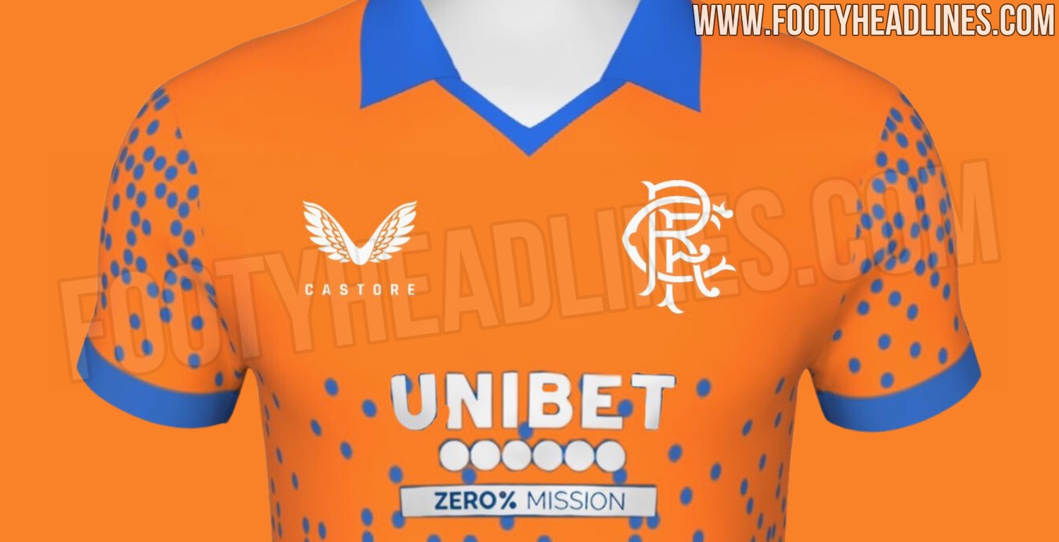
Footy headlines claiming that it’s going to be an orange kit again.
 www.footyheadlines.com
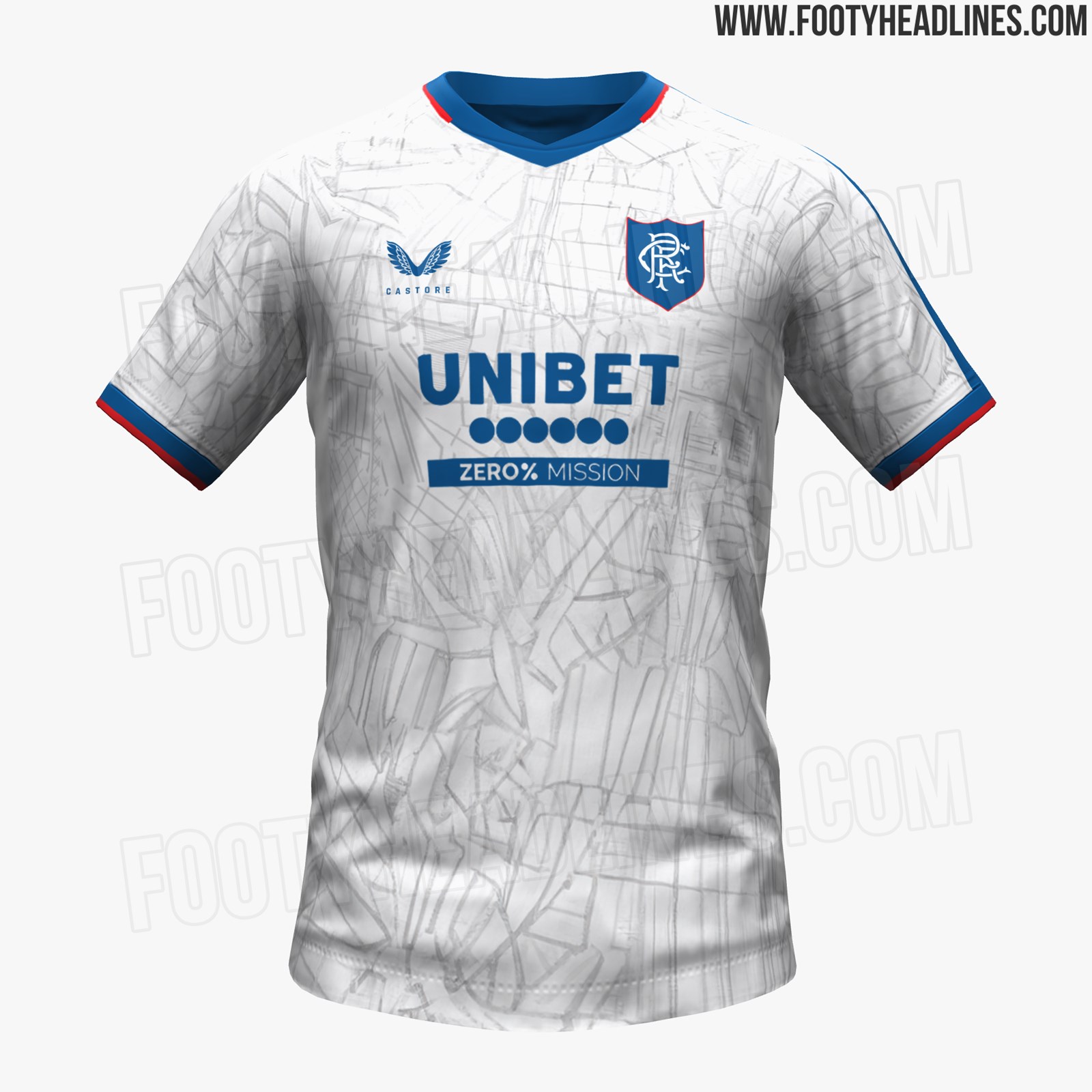
Exclusive: Rangers 24-25 Third Kit Design Leaked
Rangers' new 2024-2025 third strip will return to orange.
www.footyheadlines.com