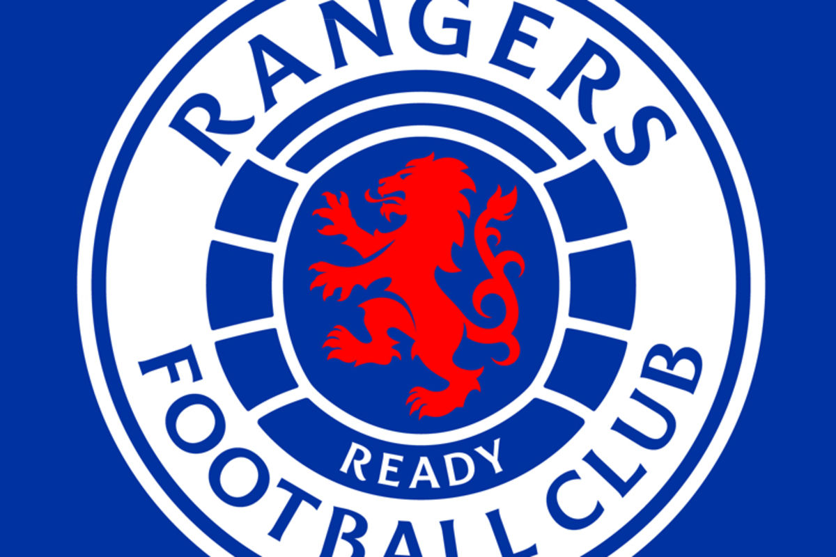
Ready For A Revolution - New Club Crest

Anyone else still not getting MyGers emails?
Emailed them last week to check I was on mailing lists but no reply yet.

And the badge is pretty smart.
 
AAAARRRRRRGGGGHHH am pure ragin!

But seriously

Yes it's changed but it's far cleaner, I'm finding it difficult to understand the issues some are having. What a fickle bunch we are.
 
Was terrified when I saw they were changing it, but thankfully it's not much of an adjustment.

Will take a wee while to get used to, but these things tend to get freshened up every so often.
 
How many new eras and chapters have we had in recent years? Hopefully there's some genuine change with this one.
 
I really like it. Modernised and smart.

However I’m more raging than the rest of you just because I want something to be absolutely raging about because we are not getting transfers leaked and the rumour page is doing my nut right in.

Raging.
 
I don't like it.

The 'Rangers' being top and centre is a marketing move but they should have just moved the writing and kept the rest the same if they felt it necessary to make the change.
 
Anyone else still not getting MyGers emails? (checked my junk folder and my contact preferences on the website). I’ve also emailed about this issue last week and not had a response.
 
Digital branding is everything now. Colours, fonts, shapes, images all need to be easily identifiable. This is us taking the steps needed to drag the club into the 21st century from that point of view.

I like it. Easier on the eye, cleaner, less lines, Rangers at the top and instantly visible.

The font looks good too, looks to me like it ties in with the shapes in the lion rampart of the badge.

Like the fact they have mentioned the colour schemes we'll be using, basically red, white, blue, black and orange and a couple of neutral tones.

Like it or not folks this is a sign that the club are embracing the digital age. Get used to it.
 
People just love to moan. It’s barely changed.

It’s not like they’ve gone all Juventus on us and totally redesigned it.
 
They moved some writing.

Nothing to get angry about but all rather pointless. Wonder how many zoom meetings went into that.
 
Marketing wise they’ll like that those who don’t immediately recognise the crest globally won’t need to tilt their heads to read it etc.

Sounds daft but wee things like that matter to these guys.
 
I hate our fans sometimes.

New Crest launch and all of Twitter is complaining for stupid reasons, just giving people ammo to laugh at us.

It looks way better

I hate our fans for complaining about the change of a part of a institution that matters an awful lot to them because it gives other fans a chance to have a go at us, even if they have legitimate gripes about it.
 
I hate our fans for complaining about the change of a part of a institution that matters an awful lot to them because it gives other fans a chance to have a go at us, even if they have legitimate gripes about it.
I'd understand this argument if the badge has never changed but this is the third iteration of this crest
 
This reminds me of the thread on the old board of the guy wanting someone to design a badge for his RSC with a bear in it. One of the funniest threads ever! The new badge is cool I like it.
 
 
Digital branding is everything now. Colours, fonts, shapes, images all need to be easily identifiable. This is us taking the steps needed to drag the club into the 21st century from that point of view.

I like it. Easier on the eye, cleaner, less lines, Rangers at the top and instantly visible.

The font looks good too, looks to me like it ties in with the shapes in the lion rampart of the badge.

Like the fact they have mentioned the colour schemes we'll be using, basically red, white, blue, black and orange and a couple of neutral tones.

Like it or not folks this is a sign that the club are embracing the digital age. Get used to it.

Good post.

You can be second to me in the most raging stakes. :))
 
Back
Top