
You are using an out of date browser. It may not display this or other websites correctly.
You should upgrade or use an alternative browser.
You should upgrade or use an alternative browser.
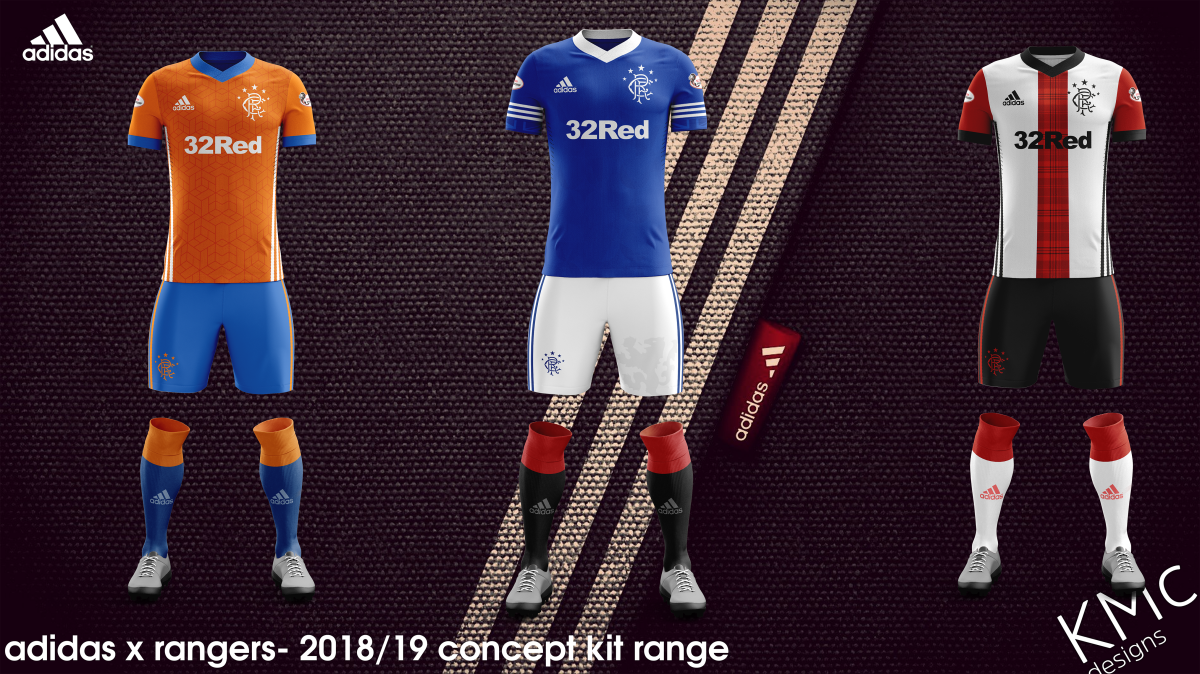
Kit Concepts- V2
CupidStunt
Well-Known Member
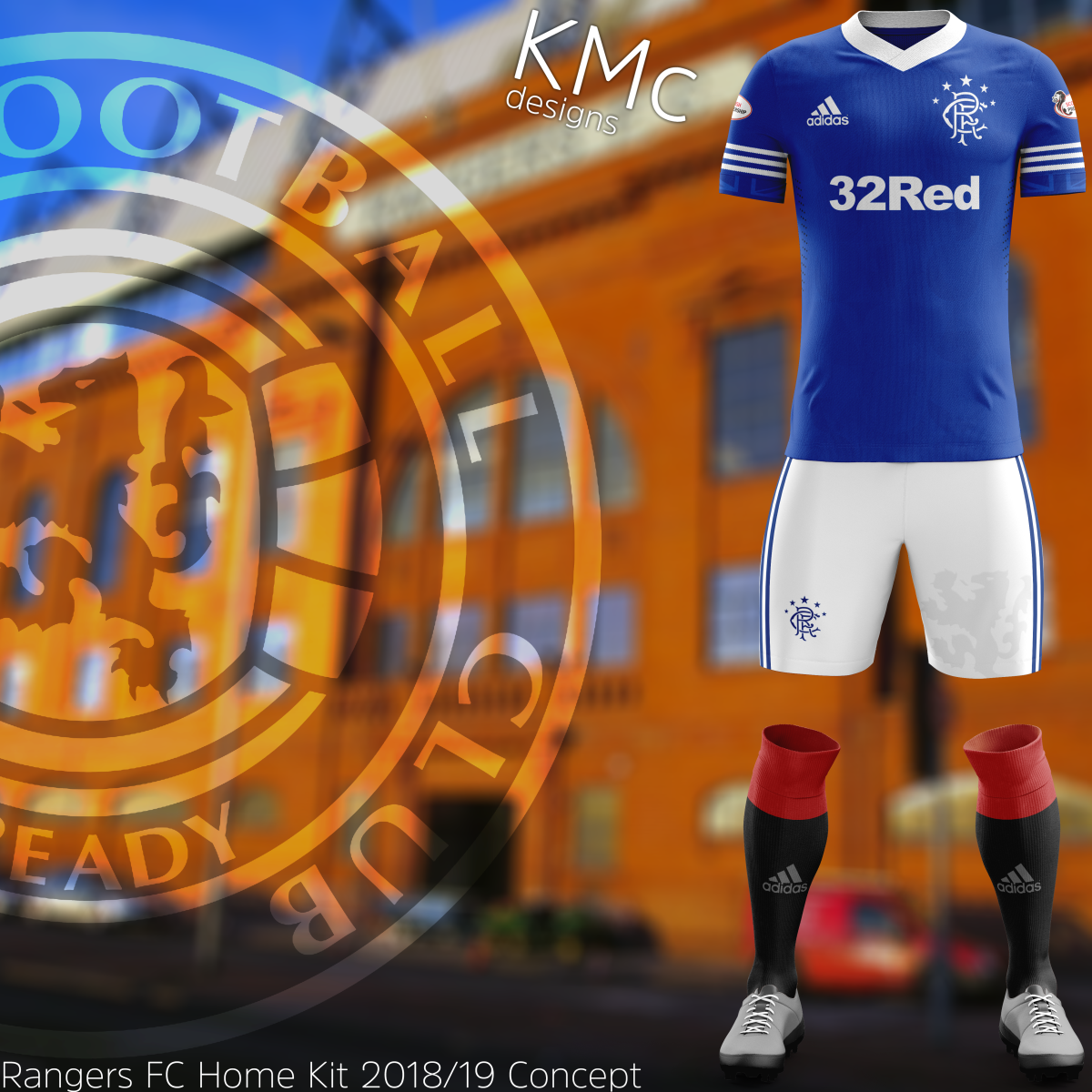
The collars are a bit too thick for my liking.
Outwith that, beautiful.
Outwith that, beautiful.
All of the Lights
Well-Known Member
Hard to pick a favourite, all 3 are nice!
GummyBear
Well-Known Member
The collars are a bit too thick for my liking.
Outwith that, beautiful.
I agree. It's all I have though. Need to pay for the regular collared digital design templates. I'll save up.
GummyBear
Well-Known Member
The collars are a bit too thick for my liking.
Outwith that, beautiful.
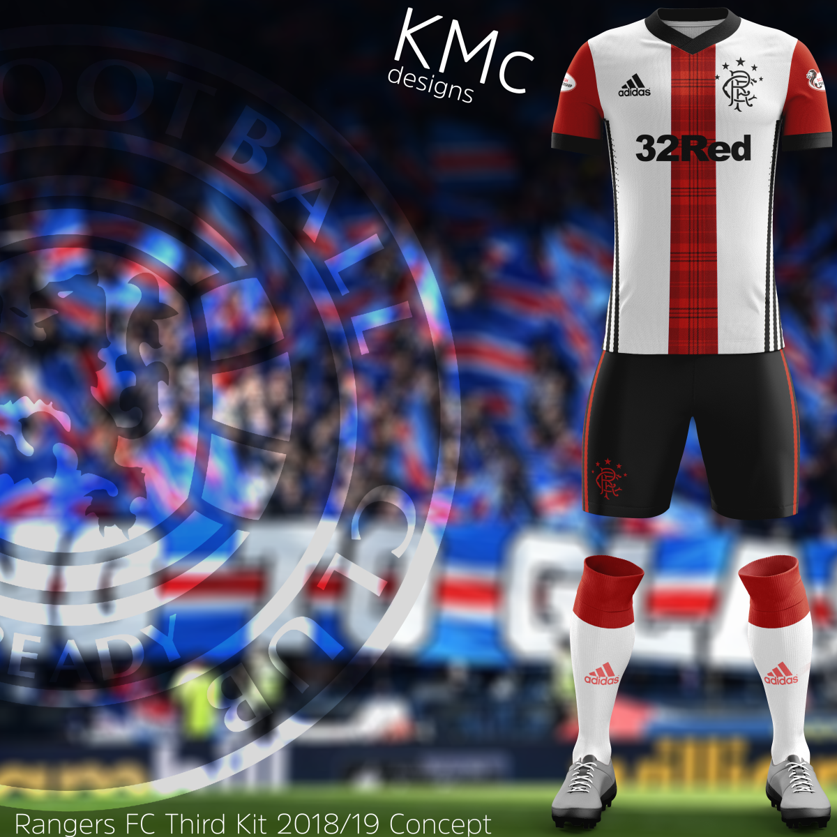
Might ditch the tartan. Was thinking it could've created a sense of 'Scottishness'. But hey, it all helps. Once I save up I'll make some using other kit styles.
TimzRFudz
Well-Known Member
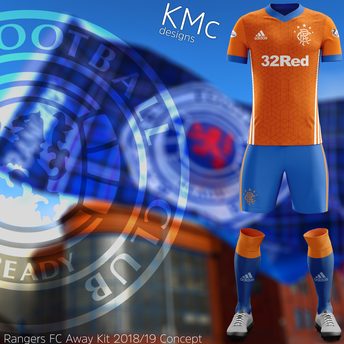
Voted for the orange one. Would have gone for the home one, but I'm not a fan of the three bands on the sleeves. I know they echo the "Gazza" strip etc, but I think just mirroring the collar, like the orange one, would look more cohesive. Not too keen on the third one tbh.
That said - all three are nice really bits of work, well done mate.
That said - all three are nice really bits of work, well done mate.
ScotiaPapac
Well-Known Member
I like all 3, can’t pick a favourite but it’s definitely one of the away ones.
GummyBear
Well-Known Member
Voted for the orange one. Would have gone for the home one, but I'm not a fan of the three bands on the sleeves. I know they echo the "Gazza" strip etc, but I think just mirroring the collar, like the orange one, would look more cohesive. Not too keen on the third one tbh.
That said - all three are nice really bits of work, well done mate.
Yeah, if you mind last week when the other one I made was doing the rounds well due to its popularity I decided it would be best I made it into a 'proper' concept. If it gets popular enough I could do fortnightly concepts and upload them solely on here. I guess it's a great way for fans to see the potential.
TimzRFudz
Well-Known Member
Yeah, if you mind last week when the other one I made was doing the rounds well due to its popularity I decided it would be best I made it into a 'proper' concept. If it gets popular enough I could do fortnightly concepts and upload them solely on here. I guess it's a great way for fans to see the potential.
Its all subjective mate. Personally I prefer as plain a home shirt as possible, but I know others differ. My own favourite of the more modern era was the blue and white NTL shirt (the one without the red panels).
Would be great to be able to assemble a few of them at the end of the season and forward onto the club. Some free marketing analysis for them as to what we like and are therefore likely to buy....
(Which they would then most likely ignore, of course....)
Hope someone within our club takes your ideas.
All 3 are brilliant.
All 3 are brilliant.
GummyBear
Well-Known Member
Damn right. Love that kit- I've got one that fits and it's a belter.Its all subjective mate. Personally I prefer as plain a home shirt as possible, but I know others differ. My own favourite of the more modern era was the blue and white NTL shirt (the one without the red panels).
Would be great to be able to assemble a few of them at the end of the season and forward onto the club. Some free marketing analysis for them as to what we like and are therefore likely to buy....
(Which they would then most likely ignore, of course....)
Last edited:
The three of those are better than we've had in sooooooo long
Orange one for me
ForzaLaudrup
Well-Known Member
All 3 are nice but the home one wins it for me by some distance!
StephenHawkinsfitbawboots
Well-Known Member
Third kit isn’t great imo
Like the home and away
Took my daughter yesterday to her 1st game yesterday and bought her the red away strip and I have to say the quality of them is terrible
Wish we could get a decent kit supplier
Like the home and away
Took my daughter yesterday to her 1st game yesterday and bought her the red away strip and I have to say the quality of them is terrible
Wish we could get a decent kit supplier
TimzRFudz
Well-Known Member
Damn right. Love that kit- I've got one that fits and it's a belter.
I've still got mine too, in good nick. I was either a fat bastard back then and its all evened out a bit. Or I've kept my athletic physique. Either way, it still fits and I'm not checking the size on the collar to find out
")
Mr Blue Sky
Well-Known Member
Home one is a cracker. Not too keen on the tartan on the 3rd
CupidStunt
Well-Known Member
I agree. It's all I have though. Need to pay for the regular collared digital design templates. I'll save up.
Are they PSD files with smart layers? If so, you can free transform/skew/warp to make them smaller?
Cumbernauld gers
Well-Known Member
All 3 are great, good work op. Home top my fav.
They're all cracking, I like the third kit especially. Some people can't stand a tartan design but that's tasteful and fittingly Scottish without being too "shortbread tin."
Lono
Well-Known Member
@GummyBear, great job, I like all three. Can I ask where you get these templates ? I'm reasonably okay with Photoshop and always wanted to try to do strips but never knew where to get the multi-layered bases some of the lads have used in the past.
Samsquanch
Well-Known Member
Great kits, like the home one best. I know it's against tradition but i like blue shorts with the blue top like we had for our uefa cup final run.
Looking at concept kits is always a terrible idea. It raises your hopes and expectations only for the official kit to look dull in comparison.
Looking at concept kits is always a terrible idea. It raises your hopes and expectations only for the official kit to look dull in comparison.
umop_3plsdn
Well-Known Member
All superb efforts. Just out of interest o.p. How long does it take you to design these?
dennyperkins
Well-Known Member
That's a fantastic effort. All 3 are excellent although being biased I would choose the home kit simply because it's similar to the classic 60s strip.
Kaiserweiss
Well-Known Member
Don’t like the third mate but well done
PMB1872
Well-Known Member
If the Home had a smaller collar and no three stripes on the sleeves I’d buy it tomorrow. third smart but would go plain red rather than tartan.Completely upped my game in kit designs thanks to some proper photoshop this time.
Home:
Away:
Third:
Refined versions of my initial ideas. Thoughts?
Sutton_Blows_goats
Well-Known Member
Home looks good bit i prefer it plainer without the addidas branding but good work mate