Ready For A Revolution - New Club Crest

Was happy with the iteration that we had, but it's done and it's ok I guess. My only tiny gripe would be I'd have preferred a slightly bigger gap between football and club. But I'll cope! :))
 
Unconvinced. Nobody had any objections to the original crest. I will get used to it, as I will have to, probably quite soon, but not a fan.
 
Email was in the junk mail folder for this one if mygers members haven't got it.

Prefer the old crest but I'm sure I won't even notice in a week or two
 
These kinds of changes are subjective and people have an emotional attachment to things (which is why they've only gone for minor adjustments) so if people prefer the older one that's totally understandable.

On the other hand, the changes are so slight that folk saying 'it's terrible!' or 'it's awful!' either thought that of the original too or are being hyperbolic.
 
Do like it better.

Only issues with it are the spacing between Football and Club.

The B in Club looks a bit out of place but overall happy

Not that anyone should really give a %^*& it’s a crest. The symbolisation of it is most important.
 
Why don’t they engage with the fans before doing this stuff ?
Probably cos we cant agree on the colour of shite. The club could release 5 different templates and then would have 5 different fan groups each wanting a different one.

As for the badge, it looks fine. Doesnt really look much different.
 
These kinds of changes are subjective and people have an emotional attachment to things (which is why they've only gone for minor adjustments) so if people prefer the older one that's totally understandable.

On the other hand, the changes are so slight that folk saying 'it's terrible!' or 'it's awful!' either thought that of the original too or are being hyperbolic.
Or are VLs with nothing but constant rage in their lives.
 
Terrible? Really? You couldn't have thought much of the original crest then because it's almost identical.

I love the original crest actually which looks nothing like this recent one.

Im assuming you meant the one prior to this one, I was also a fan of that however I really think this latest effort looks less professional and more of a cartoon version.

my opinion.
 
Can one circle be rounder than another?

Talking about the font/shapes and obviously not circles.
Suttle changes but through the eyes of a designer they are clear.
The way a brand is designed gives you a subconscious idea and opinion about the company.
To me it looks like the objective behind this design was to look friendly and welcoming.

Takes away the historic feel and strong look imo
 
Embrace change. We are trying to move forward as a club, our history and badge will still be there to look back on as we evolve. I personally dont mind it.


How anyone can prefer the new one is beyond me.
Key improvements:
- Rangers brand clearer, front and centre on the new crest
- Lion looks excellent, previous version looks to be drawn by a child
- Sharper colour contrast will look good in real world settings (advertisement boards etc).
 
I love the original crest actually which looks nothing like this recent one.

Im assuming you meant the one prior to this one, I was also a fan of that however I really think this latest effort looks less professional and more of a cartoon version.

my opinion.

Sorry didn't mean original, meant the previous one.

Just find it hard to believe if someone thinks it looks terrible when it is almost identical to the previous crest.
 
I love the original crest actually which looks nothing like this recent one.

Im assuming you meant the one prior to this one, I was also a fan of that however I really think this latest effort looks less professional and more of a cartoon version.

my opinion.

You're not being honest with yourself if you're saying this one is terrible but you like the previous one. In reality, the changes aren't anywhere near drastic enough to have such a swing of opinion.

Preferring the last version is one thing but to go from 'I'm a fan of that' to 'that's terrible' after a couple of subtle changes? Come off it, man.
 
Good post.

You can be second to me in the most raging stakes. :))
I like a good rage!

Don't get me wrong, I understand folks concerns over club traditions and maintaining our history, but it's 2020 and we're clearly investing in new digital presence. This is all part of that evolution. It's not 1970 anymore, we need to keep up with what's going on around us.

Whatever happened to 'we welcome the chase'? If we don't modernise and get involved we'll be left behind.
 
Personally I like it. Imo good to see "Ready" on the badge.
Tradition, goes back a long time.
Got to cherish our traditions and history. It's what makes us the best.
 
Was happy with the iteration that we had, but it's done and it's ok I guess. My only tiny gripe would be I'd have preferred a slightly bigger gap between football and club. But I'll cope! :))
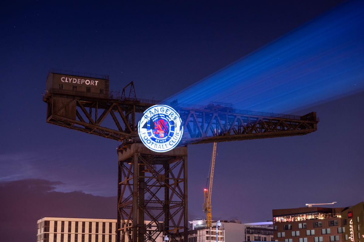
Yeah. Definitely needs a bigger gap. I’d also have reduced the font for Rangers Football Club by a point and made the football a little bigger. Nothing there though that should cause a spike in blood pressure for most.
 
The fact that some fans would like our players clean shaving, wearing club suits on flights and get uppity at the colour of the managers footwear, then a change in badge isn't going to go down well.

If the club can't make changes and move with the times then we will not progress.
 
Nvod2o3.png
 
Back
Top