
You are using an out of date browser. It may not display this or other websites correctly.
You should upgrade or use an alternative browser.
You should upgrade or use an alternative browser.
Your preferred Rangers blue?
- Thread starter Alfie shhh!
- Start date
stein and johnston
Well-Known Member
I like all of them but opted for no.7
Colinstein69
Well-Known Member
7 for me. Plus the Souness CR Smith one.
Alfie shhh!
Well-Known Member
Oh yes, love our all blue kits.I agree. I also like the kit when we change it at away games to blue shorts and socks. A full blue kit stands out and looks good. I think we should mix it up , as long as blue is the main colour


Jack Burton
Well-Known Member
I like this seasons best, it’s a very vivid shade of blue.
Just not a fan of the kit maker but that’s another point for another thread.
Just not a fan of the kit maker but that’s another point for another thread.
Then every kit looks the same. Lose sales. As long as it's blue that's the main thing.
the design should change but the colour shouldnt. Imo we should have an identified blue rather than the wildly different colours we see between years
Forth Bear
Well-Known Member
7 for me.
Allan McRitchie
Member
7 for me
BruceyBalboa
Well-Known Member
I like it as well, but just for European matches. Gives it a bit more prestige rather than using it for pish like Livingston awayOh yes, love our all blue kits.
)")
Alfie shhh!
Well-Known Member
For me, our first kit back in the Premiership and our 2004 Diadora one.Sorry to flip the question a bit, but are there any home tops over the years you've looked at and just thought: "That's not right, entirely the wrong shade of blue"


Loyal72
Well-Known Member
Why? Literally no club does this. Would severely limits ourselves.the design should change but the colour shouldnt. Imo we should have an identified blue rather than the wildly different colours we see between years


BruceyBalboa
Well-Known Member
Controversial opinion maybe, but I always felt the 94-96 home Adidas shirt was too dark a blue. Love the shirt and the memories of Gazzas hat trick against Aberdeen etc. But that one always stood out for being too dark a blue. Probably to do with all the different RFC logos thru it that were a dark colour anyway.For me, our first kit back in the Premiership and our 2004 Diadora one.
Loyal72
Well-Known Member
Thought that too, but if you look at it, it's actually quite comparable to our earlier tops, 1,2,3 and 4.Controversial opinion maybe, but I always felt the 94-96 home Adidas shirt was too dark a blue. Love the shirt and the memories of Gazzas hat trick against Aberdeen etc. But that one always stood out for being too dark a blue. Probably to do with all the different RFC logos thru it that were a dark colour anyway.
tumsheeheed
Well-Known Member
7 cup winners cup final one although it looks a lot lighter in that photo think you’ll find it was closer in colour to # 8 if memory serves
I've always been a fan of this one.

Portrushbear
Well-Known Member
Sorry to flip the question a bit, but are there any home tops over the years you've looked at and just thought: "That's not right, entirely the wrong shade of blue"
I never liked the cotton fabric umbro top we wore 2010/2011
Was like a Rugby top
Loyal72
Well-Known Member
Lovely shade of blue though!I never liked the cotton fabric umbro top we wore 2010/2011
Was like a Rugby top
Coop1872
Well-Known Member
Should the club not decide on a shade, possible poll via STs and MyGers, and register it as Rangers Blue on the Pantone scale then future kits etc will be the same colour?
I thought the club had already decided on a "Rangers blue" a couple of years ago. Assumed this would also apply to the kit.
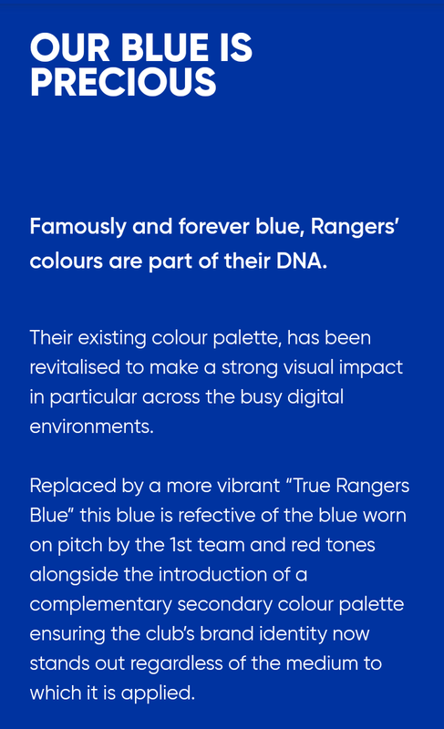
Rangers Kick Off Digital Transformation
RANGERS Football Club has today unveiled its club brand evolution and digital transformation strategy, through an enhanced suite of unified digital products including the launch of a new industry leading club website and app.
Following a lengthy consultation period with Rangers’ domestic and international supporters, partners and staff, the club is launching as part of this new initiative:
A new interactive website and app
A refreshed READY crest
A new brand identity, to include the ‘Rangers blue’ and a club typography
Sticky Fingers
Well-Known Member
7 for me. Proper Rangers blue, the iconic colour on an iconic top for an iconic club.
Another vote for one that wasn’t on the list and that’s the ‘86 top from Souness era.
Another vote for one that wasn’t on the list and that’s the ‘86 top from Souness era.
Alfie shhh!
Well-Known Member
I'd like to see what the "Rangers blue" looks like if anyone can help if possible.I thought the club had already decided on a "Rangers blue" a couple of years ago. Assumed this would also apply to the kit.
Rangers Kick Off Digital Transformation
RANGERS Football Club has today unveiled its club brand evolution and digital transformation strategy, through an enhanced suite of unified digital products including the launch of a new industry leading club website and app.www.rangers.co.uk
Following a lengthy consultation period with Rangers’ domestic and international supporters, partners and staff, the club is launching as part of this new initiative:
A new interactive website and app
A refreshed READY crest
A new brand identity, to include the ‘Rangers blue’ and a club typography
My thoughts on the poll, I'm slightly surprised our current top got 30 votes. I'm just not overly keen at all on the shade of blue. Last years was a much better colour.
Pretty shocked 8 people voted the Diadora one. It's the same colour as our sun bleached seats at Ibrox

72 people agree with my choice
(number 3) What a kit and what a team that wore that. Lovely colour. No surprise that fans view our European Cup shirt as their favourite Rangers blue though. Will be interesting to know if it was mainly older bears that voted for it or if anyone under 30 did.
Alfie shhh!
Well-Known Member
Good shout, excellent top and the blue is lovely.Another vote for one that wasn’t on the list and that’s the ‘86 top from Souness era.

Alfie shhh!
Well-Known Member
See post above mate. I really like that one.6 for me only because you didn’t put the cr smith 86/87 season top on it
gersandproud
Well-Known Member
8 is what I grew up with
& I suppose being younger at the time - my memory might be playing tricks -
But it seems as if we had the blue in 8 (although the photo shows a later toff version) for longer than any other version since
Consequently it's like any version after that - no matter how similar - isn't the 'original' - & therefore seems not as authentic
For some reason - there doesn't seem to be a 'Standard' royal blue
Anyway they're all good
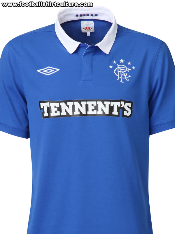
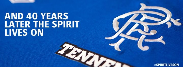
I had this 1 unsponsored (was my favourite too of my 53 year life) till my daft new bird tried to iron it.Wow it really is a cracker. Would love to see it without the cheap Tennants logo.
Edit: here it is

Alfie shhh!
Well-Known Member
Another fav of mine is the blue with white pin stripes from my first cup final in 84 and also my old man’s cousin even though not a popular player on FF played in that strip Jim bett played in it

Very nice! I wasn't born then so missed out but I'm glad good quality photos are available.
Being a nostalgic auld bassa, it's #8 for me!
Coop1872
Well-Known Member
I'd like to see what the "Rangers blue" looks like if anyone can help if possible.
My thoughts on the poll, I'm slightly surprised our current top got 30 votes. I'm just not overly keen at all on the shade of blue. Last years was a much better colour.
Pretty shocked 8 people voted the Diadora one. It's the same colour as our sun bleached seats at Ibrox
72 people agree with my choice
No surprise that fans view our European Cup shirt as their favourite Rangers blue though. Will be interesting to know if it was mainly older bears that voted for it or if anyone under 30 did.
I think these are the colour codes of the blue they came up with.
Hex #0033A0
RAL 5002
Pantone 286C
a_weir
Well-Known Member
It was about getting the logo in view when players were being interviewed, I think.
The Nike Total 90 kit templates of around the same time did it as well.
I always remind others of these kids when we get the 'it's just a template and Nike or Adidas would do us a bespoke kit'
Um, no they bloody well would not.
Faure there’s not a team
Well-Known Member
7
Alfie shhh!
Well-Known Member
Excellent info, appreciated!I think these are the colour codes of the blue they came up with.
Hex #0033A0
RAL 5002
Pantone 286C
Johnny.mcb
Well-Known Member
Has to be 3 or 8
D4RN-L
Well-Known Member
Wasn’t this just a training top at the time and the only thing we had enough of to allow Jimmy Bell to get numbers onto them for the first game?Wow it really is a cracker. Would love to see it without the cheap Tennants logo.
Edit: here it is
Bearsden Bear
Well-Known Member
The Rangers blue from the 92/93 adidas top was just beautiful.
Alfie shhh!
Well-Known Member
Agreed, it is stunning.The Rangers blue from the 92/93 adidas top was just beautiful.

Alfie shhh!
Well-Known Member
Not sure mate but there was a launch tease before the full reveal.Wasn’t this just a training top at the time and the only thing we had enough of to allow Jimmy Bell to get numbers onto them for the first game?
MrMosshead
Well-Known Member
My favourite ever top. I have two of the above (one unopened).Wow it really is a cracker. Would love to see it without the cheap Tennants logo.
Edit: here it is
Loyal72
Well-Known Member
No. If you look it has 1972 stitched into the inside of the collar, it's a retro nod to the 1972 European Cup Winners cup kit.Wasn’t this just a training top at the time and the only thing we had enough of to allow Jimmy Bell to get numbers onto them for the first game?
Amity75
Well-Known Member
I always thought they put it that high up because they were expecting squad numbers to be added to the front of shirts and the numbers would be beneath the umbro badge.That's an interesting take. Our current kit looks quite a similar shade to that. We also had a Saltire on the shoulder of our 2006/07 kit. This one reminds me of Barry Ferguson, Kris Boyd and unfortunately Paul LeGuen!


The Umbro logo was bizarrely way too high on the kits from this era.
KirkieRanger
Well-Known Member
I agree with you there mate, and I picked 8You could probably title this thread "how old are you?"
I picked 3.
W.A.T.P.
TheFrenchTank
Well-Known Member
The 1999-2001 home kit was perfection.
Latest posts
-

-
-

-

-
 Sima out, Matondo doubtful, Yilmaz to return to training next week
- Latest: stillAlwaysblue