
Alfie shhh!
Well-Known Member
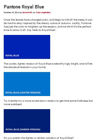
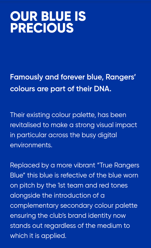
Post #84 courtesy of @Coop1872 was very helpful for me.Was a thread on here a while back about Rangers blue paint code. Anyone know it? Front door needs done and it’s a similar colour already but would be nice to get the exact one.


")


)")