
Sheik Ma Shammy
Well-Known Member
So the teams are playing in skins?
Is that what you would like to happen.?
So the teams are playing in skins?
I agree, and "busy" is the word I had in my head as well. I'd hate for it to be that.Think it's rotten and far to busy,to many different colours for me and looks like a hippy that designed it when on acid.
Some of the mock up's on here are far far better than those who get paid big bucks with these company's,I've said for years that the fans should have some sort of input into the design of any new strips,get some people to make mock ups of home,away and third top like a competition for them and then have a poll were people can vote on which ones they like.
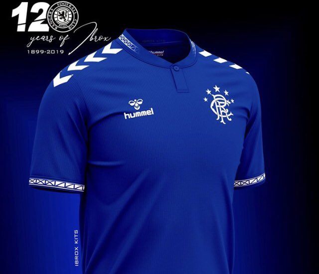
People on here design better tops than most of these big sports company's.
The top just now is £15.. that tells me a new strip is imminent
)")
Just going by others who disagree. Putting my opinion forwardNo shit Sherlock

I wear our tops to the dancing just for the ladies.People whinge every time a new strip is released. Don’t like it, hate it, looks crap......etc. It’s a blue top with a Rangers badge on it FFS. Shut up and get it bought. You are not wearing it up the dancing on a Saturday night. Absolute fannies.
So this was bullshit then?Media release tonight and to be worn v hibs apprently
Yeah I’m hoping those black lines are just to show a seam of some sort and won’t actually be there!
I was told from the start that the home had no pinstripes and there was two tone stripes to convey the same effect but it doesn’t look anything like the ‘83 kit on that, due to the different thickness of stripes
Most disappointed that it has two red lines on the collar and cuffs, as, a simple change of making it one red and one blue, like the ‘83 kit, then it would be a much better nod toward that kit.

Still not keen on it, but it should look better in the flesh.
i still remember the outcry on here over the 2008 "aquafresh"home kit we wore in Manchester.
You could win the league in a top that looks like someone spewed all over it and it becomes a classic.Win the league in that and it becomes a classic.
If its that, its awfulWin the league in that and it becomes a classic.
You know what i would lose 5 stone for that top and pay a tenner more, check the leitch design, stunningThis is the one for me,
Don’t see any hints just a terrible mock up
While it might be, why does CRO saying that’s it mean it’s a definite? Genuine question here.CRO have confirmed that's the shirt. Obviously a low quality designed picture so need to see it in the flesh
https://www.thecoplandroad.org/2019/04/a-sneak-peak-at-2019-20-rangers-kits.html?m=1
While it might be, why does CRO saying that’s it mean it’s a definite? Genuine question here.
I have a 11 inch cock. There you go, I’ve said it, so it must be true.
Haha..post of the season!!!!! BravoPeople whinge every time a new strip is released. Don’t like it, hate it, looks crap......etc. It’s a blue top with a Rangers badge on it FFS. Shut up and get it bought. You are not wearing it up the dancing on a Saturday night. Absolute fannies.
I’ll take your word for it. That’s enormously disappointing. Mock-up drawing or not, that top looks like a shitshow. I think most of us could design something more appealing. Can’t see how it would look so much better in real life. These drawings are never miles out.Given their very close links to the club, it will be true
No truth or any source confirming it. Remember last season when folk were saying that turkey Union Jack tap was the new kit?
While it might be, why does CRO saying that’s it mean it’s a definite? Genuine question here.
I have a 11 inch cock. There you go, I’ve said it, so it must be true.
Instantly looks better with the red and blue on the collarStill not keen on it, but it should look better in the flesh.
i still remember the outcry on here over the 2008 "aquafresh"home kit we wore in Manchester.
Fair dos. Never noticed it before.To be fair boss CRO are well quoted so you can pretty much take it as ITK
I don’t get the grey diamond at the collar and don’t like this idea that every home top is going to have multiple shades of blue. Let’s stick to the traditional blue.I think if you look at the template and try and visualise it without the black lines , with hopefully the chevrons being blue and therefore more subtle , and the stripes being more blended and less obvious than the sketch , then hopefully it could actually be semi decent .
I don’t get the grey diamond at the collar and don’t like this idea that every home top is going to have multiple shades of blue. Let’s stick to the traditional blue.
We hope.It'll look much better in the flesh.
All the busyness won't be there in real life. The lines etc are exaggerated to mark where colours differ slightly. They won't be visible on the actual product. The two tone blue will be barely noticeable.
Source plz
How do you know when its getting realised?It really is impossible to tell from the picture but the concept is fucking busy looking. The stripes will need to be really subtle and the Chevrons will need to not be so in your face.
Still glad its going to be out for the end of the season and well in advance of next!
The poster said we won't have a new kit until the courtcase is sorted, I'd suggest that is untrue as the team will have a new kit whatever the outcome.WOW! What a terrible post, maybe you should educate yourself on what's happening rather than coming out trying to be smart.
Anyone know if we're back to an embroidered badge?
Anyone know if we're back to an embroidered badge?
I'd doubt that.
Embossed much better anyway in my view